Data table
Basic data table
The data table component is designed in a way for additional functionality to be added on to fit your team’s needs.
The basic data table is shipped with a base style, which includes:
- Borders
- No zebra striping, row dividers instead.
- No Pagination, search, table toolbar, or multiselect
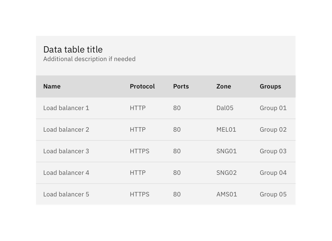
Basic data table
Additional functionality
The following can be added to the data table to increase its functionality.
Pagination
Pagination divides table data into separate pages. Pagination is accompanied by an option that enables the user to change the number of items per page. See the pagination component for further guidelines.
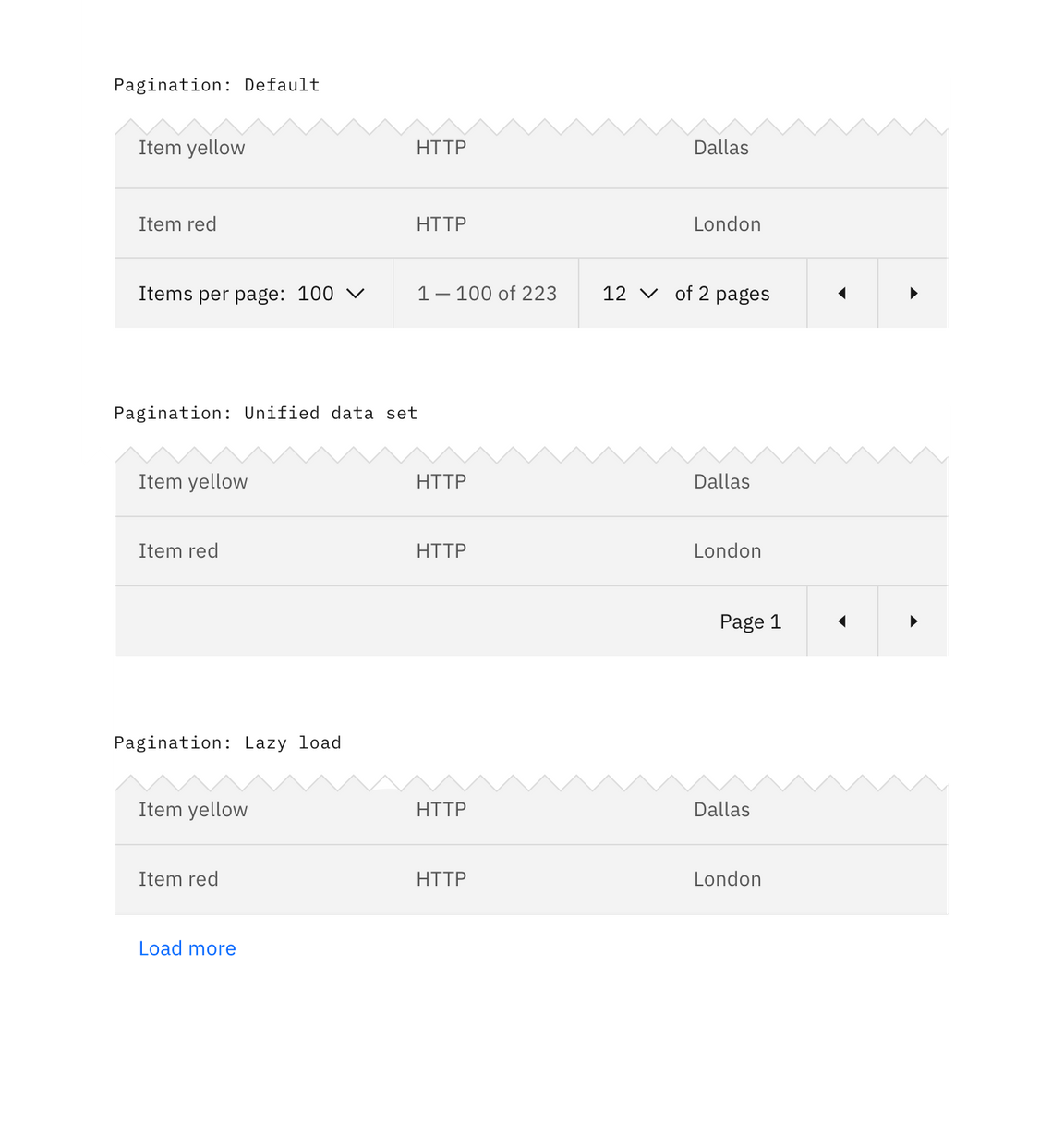
Data table with various Pagination methods
Search
Search returns results based on matches. It is used to locate and display a set of results. Search functionality within a table follows small search conventions. Search should be closed by default, and live below the table title.
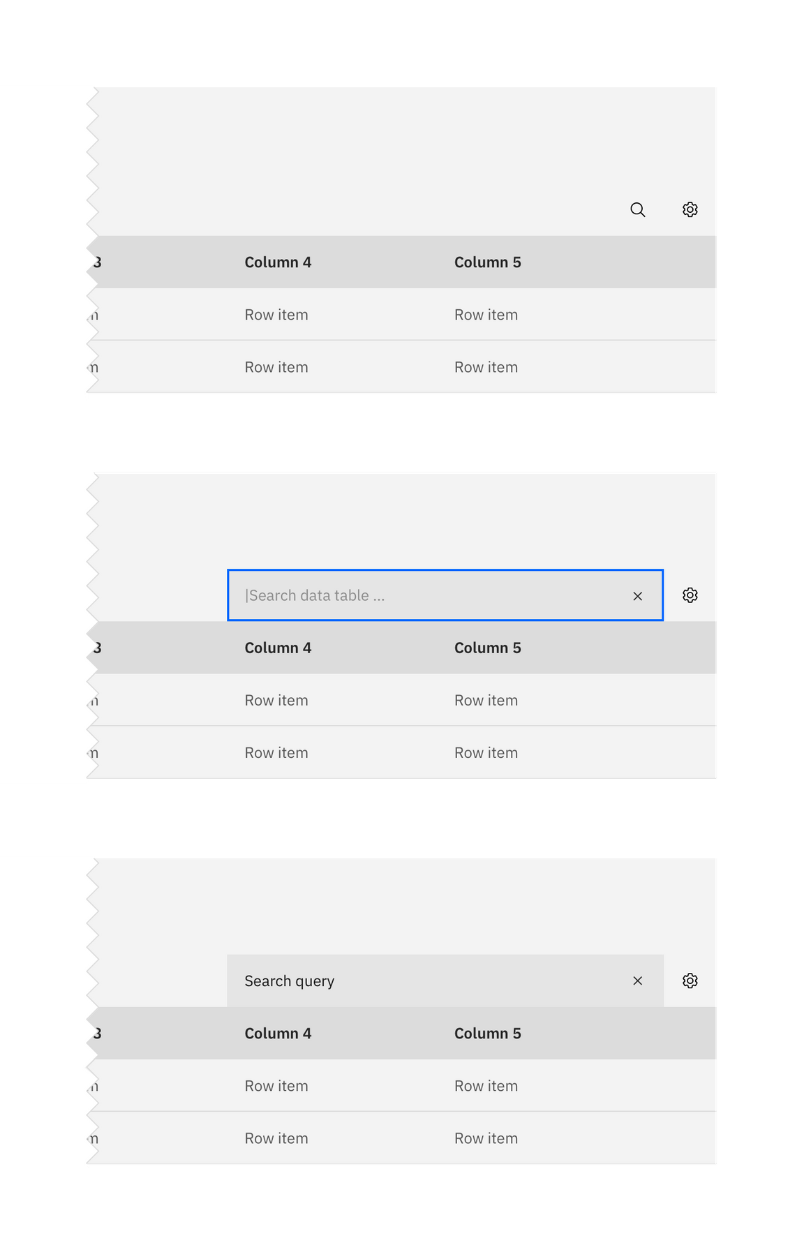
Search on data tables.
Sorting
Make data sortable to improve table usability. Sorting controls are located in the column headers and indicated with an arrow icon.
A sorted data table has three states: unsorted (arrows), sorted-up (arrow--up) or sorted-down (arrow--down). The icon indicates the current sorted state and is only shown if sorting is activated. Only the column being sorted should display an icon, and unsorted icons are only visible on hover. You can see a demo of table sorting in Carbon’s React Storybook.
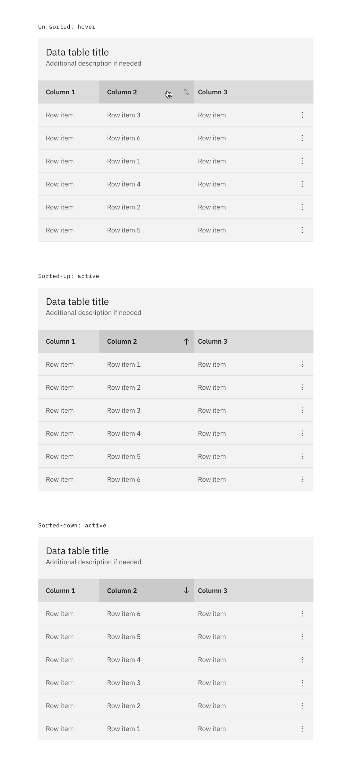
Sorting on data tables
Table toolbar
The table toolbar is reserved for global table actions such as table settings, complex filter, export, or editing table data. Additional options can be added if you have an icon to support that function. Icons should be 16x16 px (glyphs). We recommend using no more than 5 icons within the table toolbar.
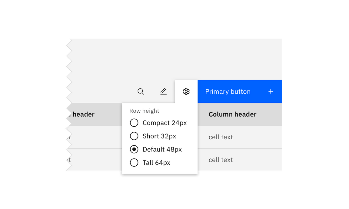
Table toolbar: table settings
Multiselect / batch action
Batch actions are functions that may be performed on multiple items within a table. Once the user selects at least one row from the table, the batch action bar appears at the top of the table, presenting the user with actions they can take. To exit or escape “batch action mode,” the user can cancel out or deselect the items.
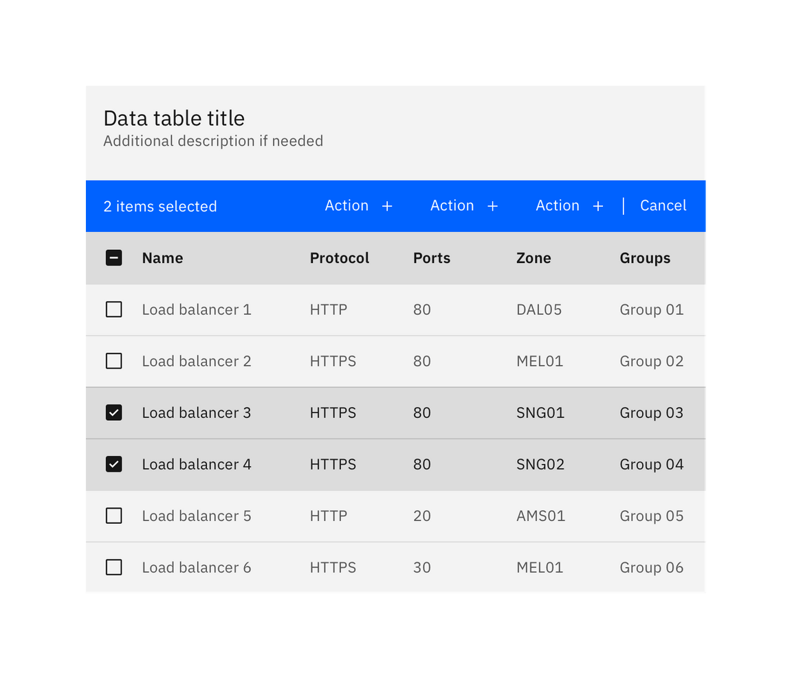
Batch action mode on data tables
Inline actions
Inline actions are functions that may be performed on a specific table item. Each row is accompanied by an overflow menu that contains actions related specifically to that table row.
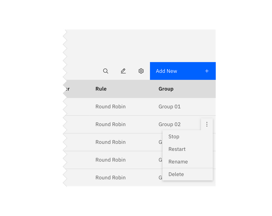
Overflow menu example
When the overflow menu contains less than three options, keep the actions inline as icon buttons instead. This reduces 1 click and makes available actions visible to users at a glance.
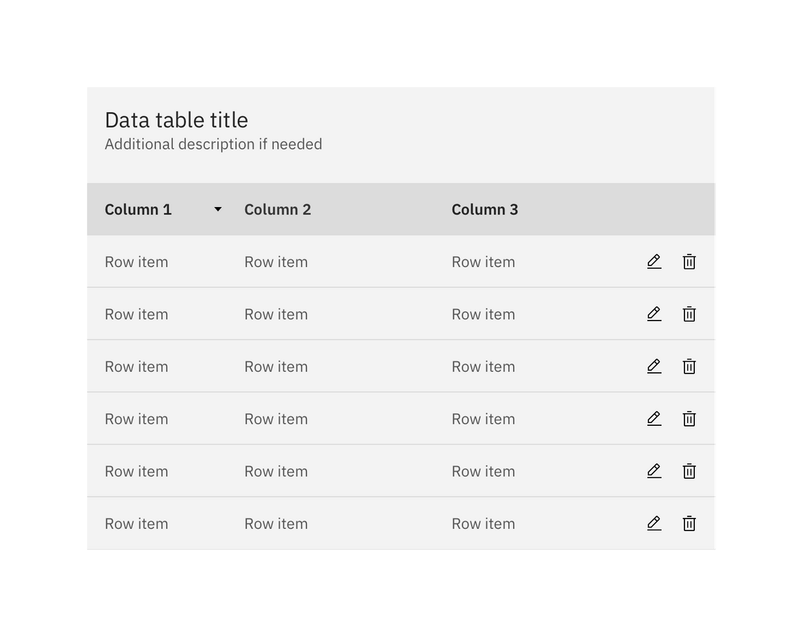
Overflow menu example
Persistent overflow menu
By default, the overflow menu icon appears on hover or focus. This reduces visual clutter and drives user interactions with clear context and results.
Data table also supports persistent overflow menu icons. Overflow icons should only persist if the actions contained within them are core to the function of your table. Enabling persistent overflow icons may complicate data presentation and impact general usability.
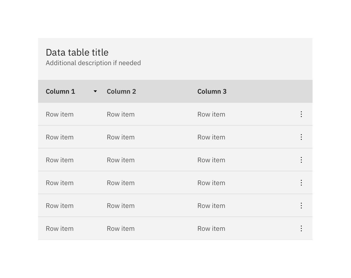
Overflow menu example
Expandable
The expandable data table is useful for presenting large amounts of data in a small space. Use the expanded section for supplementary information or data that needs additional query time.
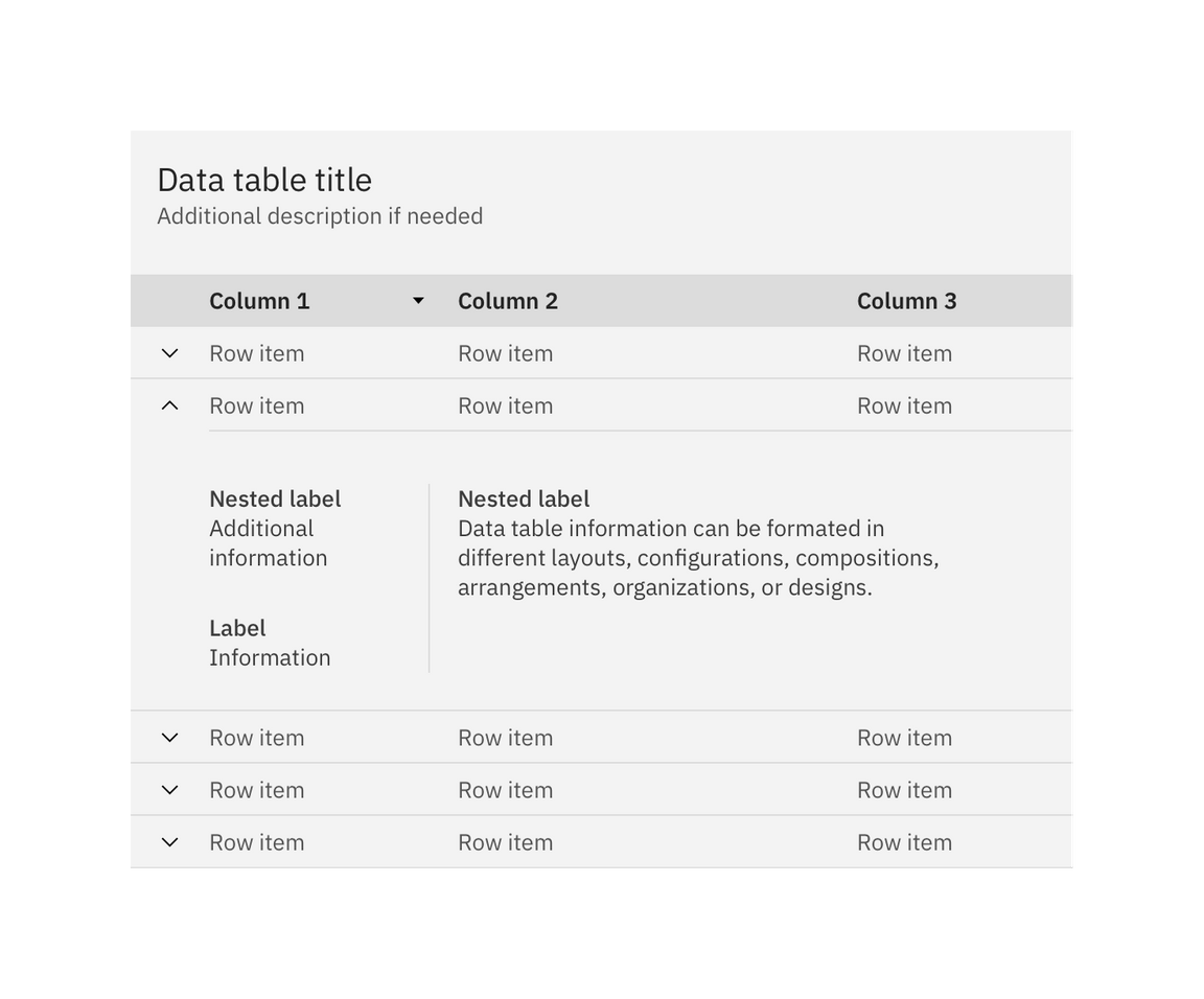
Expandable data table with one row expanded
By default, the expand-all chevron is not shown. Keeping detailed information in expanded section saves user loading time by postponing some data queries until needed. Expanding all rows at once will typically negate this advantages of the expandable table. If additional load time is expected to display expanded information, use skeleton states instead of spinners.
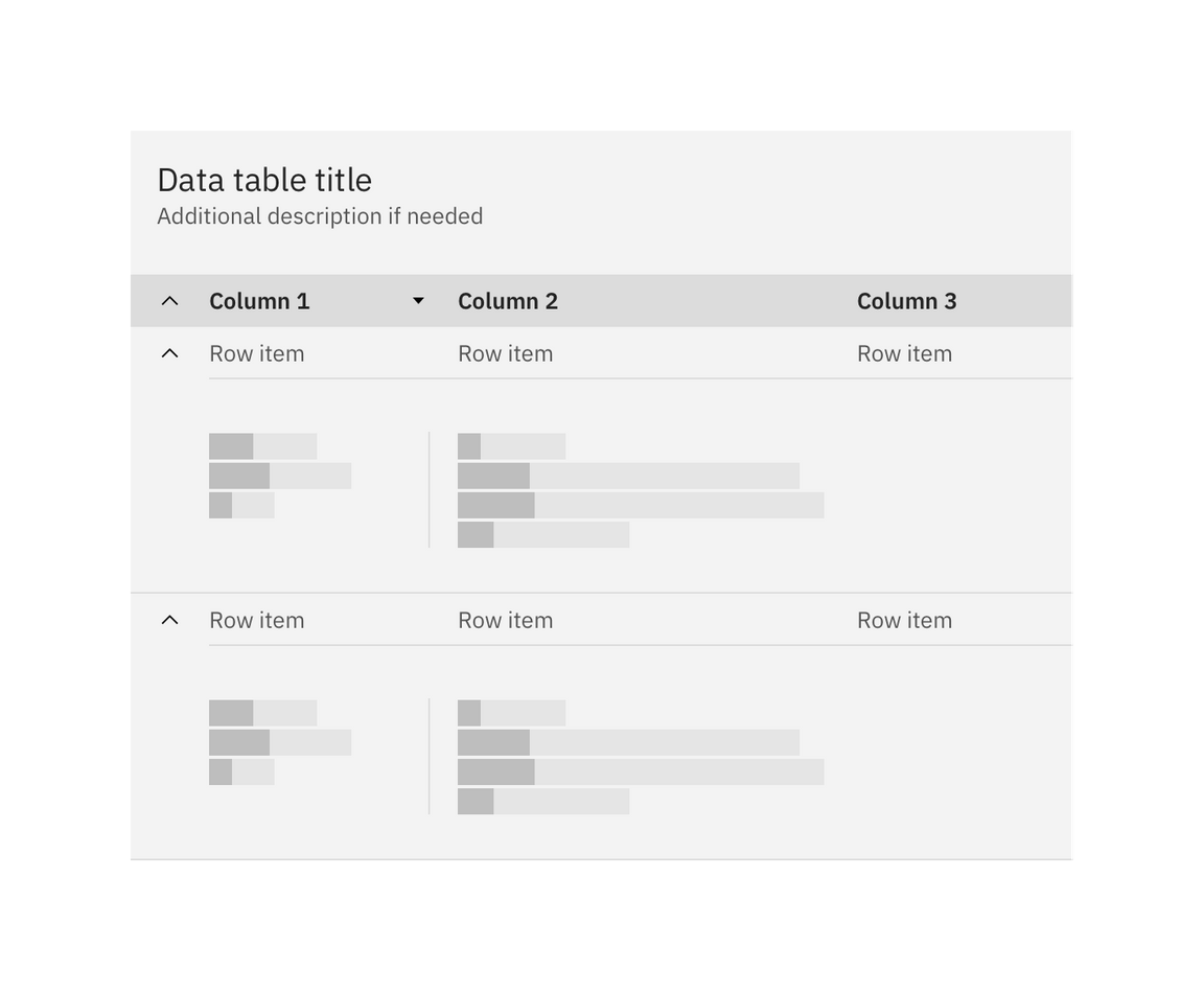
Expandabling all rows with skeleton states