Breadcrumb
Color
| Class | Property | Color token |
|---|---|---|
.bx--link | color | $link-01 |
.bx--link:hover | color | $hover-primary-text |
.bx--breadcrumb-item::after | color | $text-01 |
Typography
When a user hovers overs a breadcrumb, the breadcrumb title should be underlined.
| Class | Font-size (px/rem) | Font-weight | Type token |
|---|---|---|---|
.bx--link | 14 / 0.875 | Regular / 400 | $body-short-01 |

Breadcrumb typography treatment example
Structure
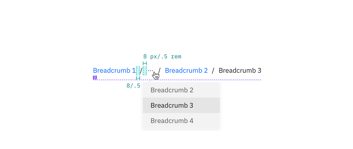
The on-click dropdown should follow the overflow menu specs for sizing, padding, and interaction.
| Class | Property | px/rem | Spacing token |
|---|---|---|---|
.bx--breadcrumb-item | margin-left | 8 / 0.5 | $spacing-03 |

Structure and spacing measurements for breadcrumb | px / rem
Recommended
Truncated breadcrumbs are not currently built into the breadcrumb component. The following colors from the overflow menu are recommended for the overflow breadcrumb list.
Color
| Class | Property | Color token |
|---|---|---|
.bx--overflow-menu-options__btn | color | $icon-01 |
.bx--overflow-menu-options__option:hover | background-color | $hover-row |
Typography
| Class | Font-size (px/rem) | Font-weight | Type token |
|---|---|---|---|
.bx--overflow-menu-options__btn | 14 / 0.875 | Regular / 400 | $body-short-01 |
Structure
| Class | Property | px / rem | Spacing token |
|---|---|---|---|
.bx--overflow-menu-options | height | 32 / 2 | – |

Recommended structure and spacing measurements for breadcrumb | px / rem